Kitchen Staging Tips for Listing Photos That Sell
Buyers judge a home by its kitchen. Here's how to make yours photograph like the heart of the house.
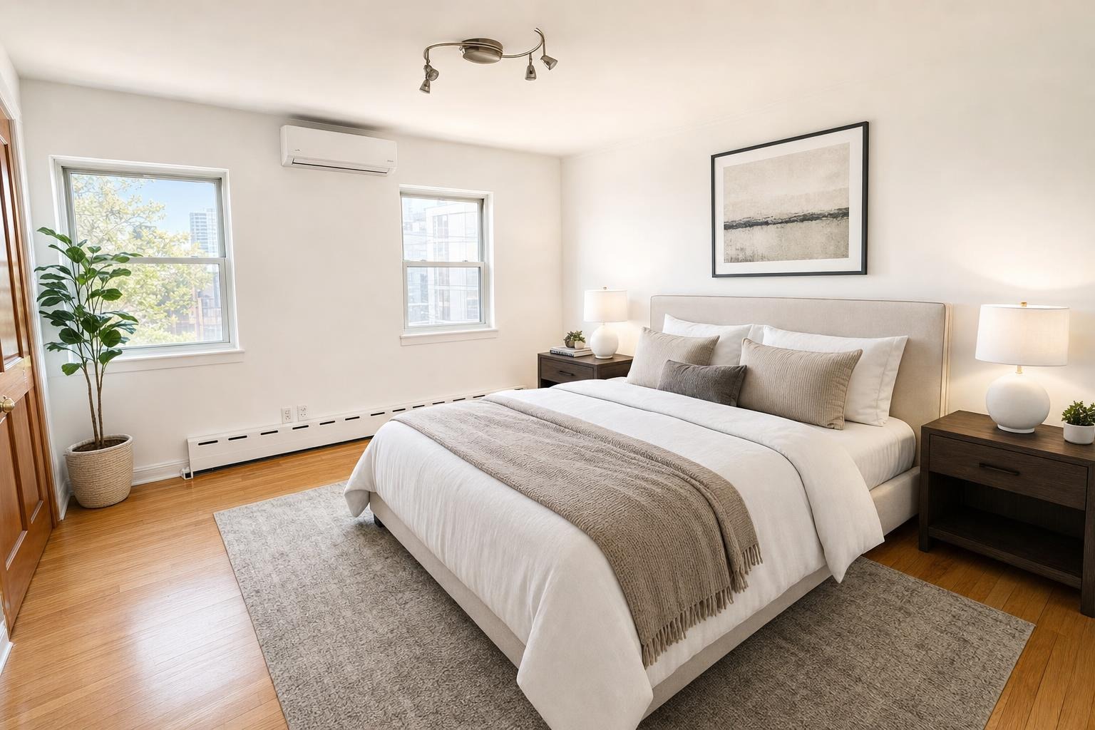
 after · staged
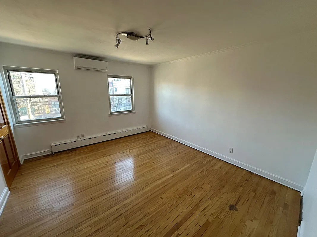
before
after · staged
before
Of every room in a listing, the kitchen does the most selling. It's the space buyers linger on in the photo gallery, the one they screenshot to text their partner, and the single biggest driver of whether a home feels move-in ready or like a project. Get the kitchen photo right and the whole listing reads warmer. Get it wrong — cluttered counters, a glare on the stainless, dim overhead light — and even a great kitchen looks tired. The good news: staging a kitchen for photos isn't about renovation. It's about subtraction, a few intentional touches, and light.
Why the kitchen is the highest-leverage room
Kitchens and bathrooms sell houses, and the kitchen leads. It's where families imagine their actual life happening, so it carries more emotional weight than any bedroom. That also means it's the room where small flaws get punished hardest — a crowded counter or a smudged faucet reads as "this home wasn't cared for," fair or not. Because the stakes are high and the fixes are cheap, the kitchen is where an hour of staging returns the most. Spend your prep time here first.
Clear the counters to near-empty
This is the single biggest move, and most sellers underdo it. The camera flattens depth and exaggerates clutter, so a counter that looks "lived-in" in person looks chaotic in a photo. Strip the surfaces down to almost nothing:
- Hide the toaster, knife block, and dish rack — they read as visual noise and shrink the counter.
- Stash the dish soap, sponges, and scrub brushes under the sink. Nothing kills a clean look faster.
- Clear the fridge of magnets, photos, kids' art, and the calendar. A bare fridge front looks twice as big.
- Pull the mail, chargers, vitamin bottles, and paper towels off every surface.
The goal isn't sterile — it's spacious. Empty counters tell the buyer there's room to work, which is exactly what they're shopping for. This is the same principle that runs through our declutter-before-photos checklist: every object you remove makes the room photograph bigger.
Add a few intentional accents
Once it's clear, you don't leave it bare — you add back two or three deliberate touches that make the kitchen feel alive and warm without crowding it. Think editorial, not everyday:
- A bowl of fresh fruit — green apples or a pile of lemons add a clean pop of color.
- A wood cutting board leaned against the backsplash for warmth and texture.
- A small plant or a pot of fresh herbs by the window.
- A folded tea towel over the oven handle, and maybe a French press or simple coffee setup near the cooktop.
Three accents is plenty. The rule is that everything left on the counter should look like it was placed on purpose, because in the photo, it was.
Make every surface gleam
Light is unforgiving on dirt. Before you shoot, give the kitchen a hard clean with the camera in mind:
- Wipe down the counters and buff out streaks — granite and quartz show every smear under flash.
- Polish the faucet and any stainless steel until it shines. A spotty faucet is the first thing the eye snags on.
- Clean the backsplash and the range — grease film catches light and looks grimy on camera.
- Shine the cabinet fronts and hardware, especially around the handles where fingerprints collect.
A kitchen that physically gleams photographs as new. It's the cheapest upgrade there is.
Get the lighting right
Bad light makes a beautiful kitchen look like a basement. Good light does the opposite. When you shoot:
- Turn on every light — under-cabinet strips especially, plus overheads and pendants. Layered light gives the room depth.
- Open the blinds and curtains all the way to pull in daylight and brighten the corners.
- Shoot in daylight, ideally mid-morning, when the natural light is soft and even rather than harsh.
- Mix the two — warm interior light plus bright window light reads inviting, not clinical.
If your interior bulbs are a cold blue, swap in warm-white ones before the shoot. The color temperature of the light changes the whole mood of the photo.
Shoot the angle that shows the layout
The best kitchen photo tells the buyer how the space works. Shoot from a corner rather than straight on so you capture two walls, the depth of the counters, and — if there is one — the island. The island is a selling feature; frame it. Hold the camera at chest height, keep the verticals straight so the cabinets don't lean, and back into a doorway to fit as much of the room in as you can. One wide, well-lit corner shot beats five tight crops of individual counters.
Small upgrades that read on camera.
New cabinet hardware is a cheap swap that photographs as a remodel. A vase of fresh flowers on the island or a small bouquet by the sink adds life and a hit of color in the exact spot the eye lands. These are the details that make a buyer think "this kitchen is loved."
When the kitchen is dated or empty
Sometimes the room itself fights you — the cabinets are oak from 1995, the lighting is grim, or the home is vacant and the kitchen feels cold and bare in every shot. You can still get a photo that pulls showings. Upload the picture and Stylst will brighten it, warm the light, and virtually stage the room in about a minute for around $1 a photo, keeping the real layout intact so the listing stays honest. It's the fastest way to make a tired kitchen read as the heart of the house. If you want to pair it with a fuller design direction, our roundup of interior design styles for listing photos walks through the looks that photograph best.
Try it on your next kitchen shot — stage a photo here — and see the difference clean counters, warm light, and a few accents make. Stylst is available on Google Play.